
This airline name has been resurrected like a phoenix from the fire, but the bird featured is a hummingbird, common in Ecuador. The sleek dark blue, yellow, and aqua blue bird appears to fly at speed over a modern font with an “A” that reminds me of the country’s many volcanoes.

The Mangōpare is the Māori symbol for hammerhead shark, and features prominently in Air New Zealand‘s logo. It also makes me think of 🌬️ emoji; a gust of wind up there where aircraft fly. I also love the bold, confident font.
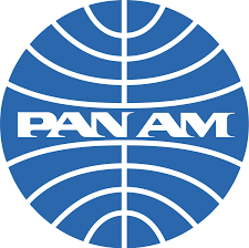
A legendary airline with a legendary logo, which first began to take this form in 1955 (28 years after the Pan Am’s formation). Representing the globe and its meridians, combined with the speedy font this logo screams travel even 30 years after the airline ceased operations.
This memorable airline logo features a flying elephant called Skypower. How could you possibly miss those oversized ears on the runway? Nigeria Airways (which ceased operations in 2003) had, of course, the Nigerian flag as its background.
Back to modern times, and this neat logo from Qatar Airways. It packs in large text, the airline’s name in Arabic, a roundel featuring shrinking lines that denote speed, and an elegant Arabian onyx. Impressive. I also like the use of sophisticated burgundy, befitting this 5-star airline.
Well, this is certainly bold. It also reminds me of the Intel logo. It’s actually the logo of now-defunct low-cost Austrian airline Niki, and stands out thanks to its unusual (for airline logos) ellipse, handwriting font and thick lines.
This is Sir Turtle. He’s the best part of the Cayman Airways logo (I’m not a fan of the outdated font). Originally created by designer Suzy Soto for a holiday resort and sold to the Cayman Islands government for a bargain $1, at first glance it appears as though Sir Turtle has a peg leg and sword. On closer inspection he does actually have a peg leg and sword, plus natty red flying scarf added in 1978.
